Site Navigation and Toolbar
The Gotransverse help site includes several elements and tools to help you navigate and access the topics.
Header
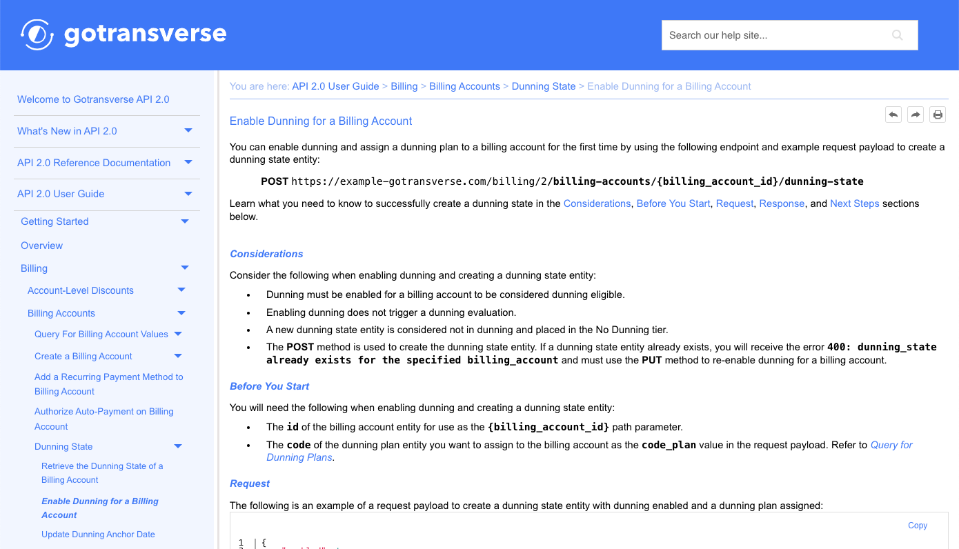
The header includes a link to the Help Center home page and a search field. Click the Gotransverse logo to open the Help Center home page. Refer to Website Search for more information on using the search field to find related topics.

Header
Side Navigation Panel
The side navigation panel includes the table of contents for all sections and sub-sections of the site. Each section can be expanded or collapsed by clicking either the ![]() or
or ![]() icon, respectively.
icon, respectively.
The side navigation panel can be adjusted to a desired width. Hover your mouse over the panel divider until the pointer changes to a ![]() . Move your mouse either left to decrease the width or right to increase the width.
. Move your mouse either left to decrease the width or right to increase the width.
![]()
Adjust Side Navigation Panel Width
When you have navigated to a topic, the side navigation panel will expand to show the location of the topic within the table of contents. The topic title will also be highlighted in bold italic text. For example, if you navigate to the Enable Dunning for a Billing Account topic, the navigation panel expands to the topic location, and the topic title displays in bold italic text. In addition, the path to the topic is shown in the breadcrumbs.

Topic Highlighted in Side Navigation Panel
Breadcrumbs display at the top of every page to show the location of the current topic in relation to the main section. For example, as shown in the image above, the breadcrumbs begin with the API 2.0 User Guide and then list the topics leading to the current topic. You can click on any of the links within the breadcrumb header to go to that page.
Toolbar
The toolbar is located at the top right of every page. The toolbar includes three icons for navigation and printing or saving:
![]() — Previous topic. Click to move to the topic that is just before this topic in the navigation panel.
— Previous topic. Click to move to the topic that is just before this topic in the navigation panel.
![]() — Next topic. Click to move to the topic that is just after this topic in the navigation panel.
— Next topic. Click to move to the topic that is just after this topic in the navigation panel.
![]() — Print topic. Click to print the topic or save the topic as a PDF. Only the current topic is printed or saved.
— Print topic. Click to print the topic or save the topic as a PDF. Only the current topic is printed or saved.
Responsive Layout
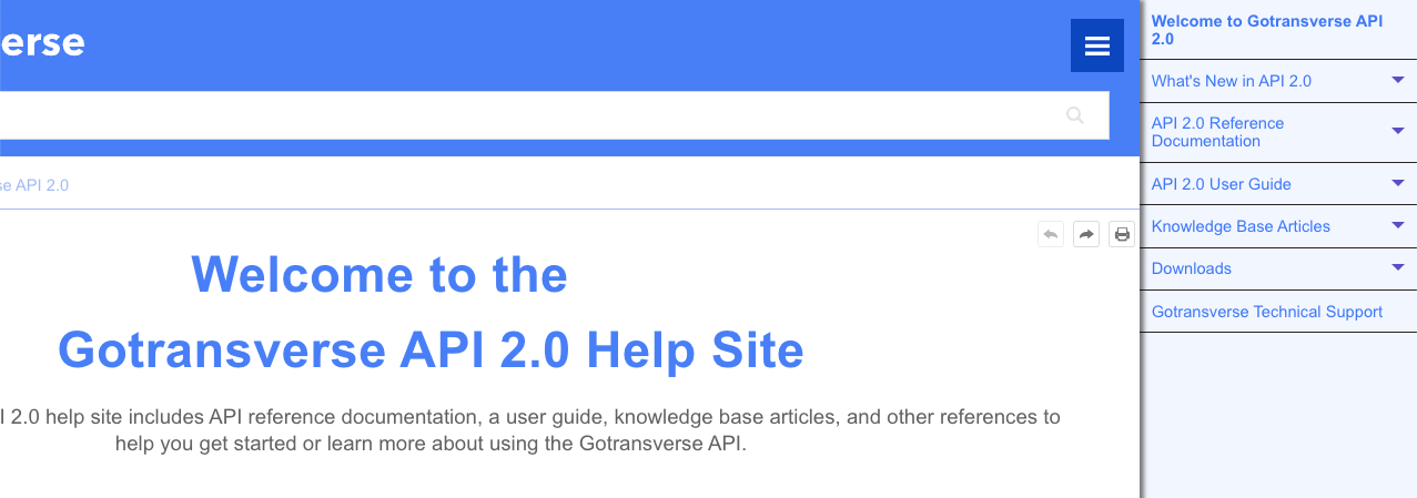
The site adjusts to your screen size or any changes to the window size. If the window size is reduced to less 1575 pixels, the side navigation panel will disappear. An alternate navigation panel will then be available from the ![]() icon. Click the icon to open a slide-out navigation panel. Click the icon again to close the slide-out panel.
icon. Click the icon to open a slide-out navigation panel. Click the icon again to close the slide-out panel.

Slide Out Navigation Panel
Topic Updated: 10/2024.